Edit Content

Contact Us
Edit Content


Our Genesis
Vision & Mission
Motto & Logo
Leadership
Why Queen’s College
Facilities & Features
Quest for Excellence,
United Vision,
Empowering,
Engaging,
Nurturing Potential
Solidarity
Quest for Excellence, United Vision, Empowering, Engaging, Nurturing Potential” reflects Queens’ College commitment to fostering a culture of continuous improvement and collaboration. We believe in the shared goal of empowering students through an engaging and supportive environment while nurturing their unique abilities to help them achieve their highest potential. This holistic approach ensures that every student is equipped for success both academically and personally.
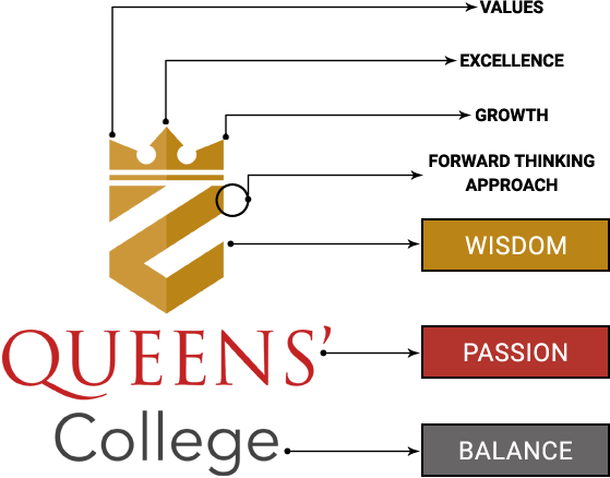
The Queens’ College logo is a modern symbol that speaks to the school’s core philosophy of Values, Excellence, and Growth. The geometric crown, with its three distinct peaks, represents these guiding pillars—showcasing the school’s focus on holistic development. The essence of Queens’ College—a place where tradition meets innovation, fostering an environment where students are encouraged to grow, lead, and excel with confidence and integrity.
Symbolism:
At the heart of the logo is a modern, geometric Crown set within a Crest. The structured design of the crown conveys precision, stability, and a strong educational foundation. The crest’s sharp angles indicate a forward-thinking approach, reinforcing that Queens’ College nurtures disciplined yet innovative thinkers who are prepared to lead. This reflects an educational approach that nurtures both academic rigor and personal development, ensuring students thrive in all aspects of life.
Colour Palette:
– Gold signifies success and wisdom, reflecting the school’s commitment to academic and Growth.
– Red embodies passion and determination, underscoring a drive for Excellence.
– Grey brings balance, signifying a welcoming, grounded environment that Values every child’s potential.
Typography:
The serif font for QUEENS’ evokes tradition and reliability, while the sans serif College denotes openness and clarity. The juxtaposition of serif and sans serif creates a harmonious balance between tradition and innovation


CBSE MANDATORY DISCLOSURE
POLICIES
NEWS & UPDATES
RESULTS
CIRCULARS
EXAMINATION
ADMISSION GUIDELINES
FEE STRUCTURE






© 2024 QUEENS’ College. All Rights Reserved.